User testing at the BHF
Whether our users are registering for a fundraising event, signing up to the Heart Matters magazine or ordering health care information booklets and brochures, forms always play a part in our services and products when users they are trying to complete tasks on the British Heart Foundation (BHF) website.

Old form design

New form design
The old multi-step forms were updated to be more accessible and user friendly across devices. The approach of asking one question per step to encourage users to not only focus on the question and their answer but to also avoid them from being distracted and overwhelmed from too many unrelated questions on a single page was introduced.
However, there are times where grouping related questions on the same page/form step is also encouraged.
The new multi-step form also consists of a progress indicator on the left, which was also present in our old forms but with a slightly different UI.
This was kept as there are some benefits to the user, such as:
Letting them know where they are in the form
Showing them what is coming up next
Setting expectations of what information will be asked
So why test it?
It’s important that we continually gather feedback from our users. Real people using our website give us a wealth of insights and help us make better products and there are a number of ways to connect with them, including: surveys, user experience studies, conversion rate optimisation testing, social media and feedback to our customer service team.
We decided to A/B test the form to learn if the progress indicator had any quantitative impact on conversions (users completing the form).
What is an A/B test?
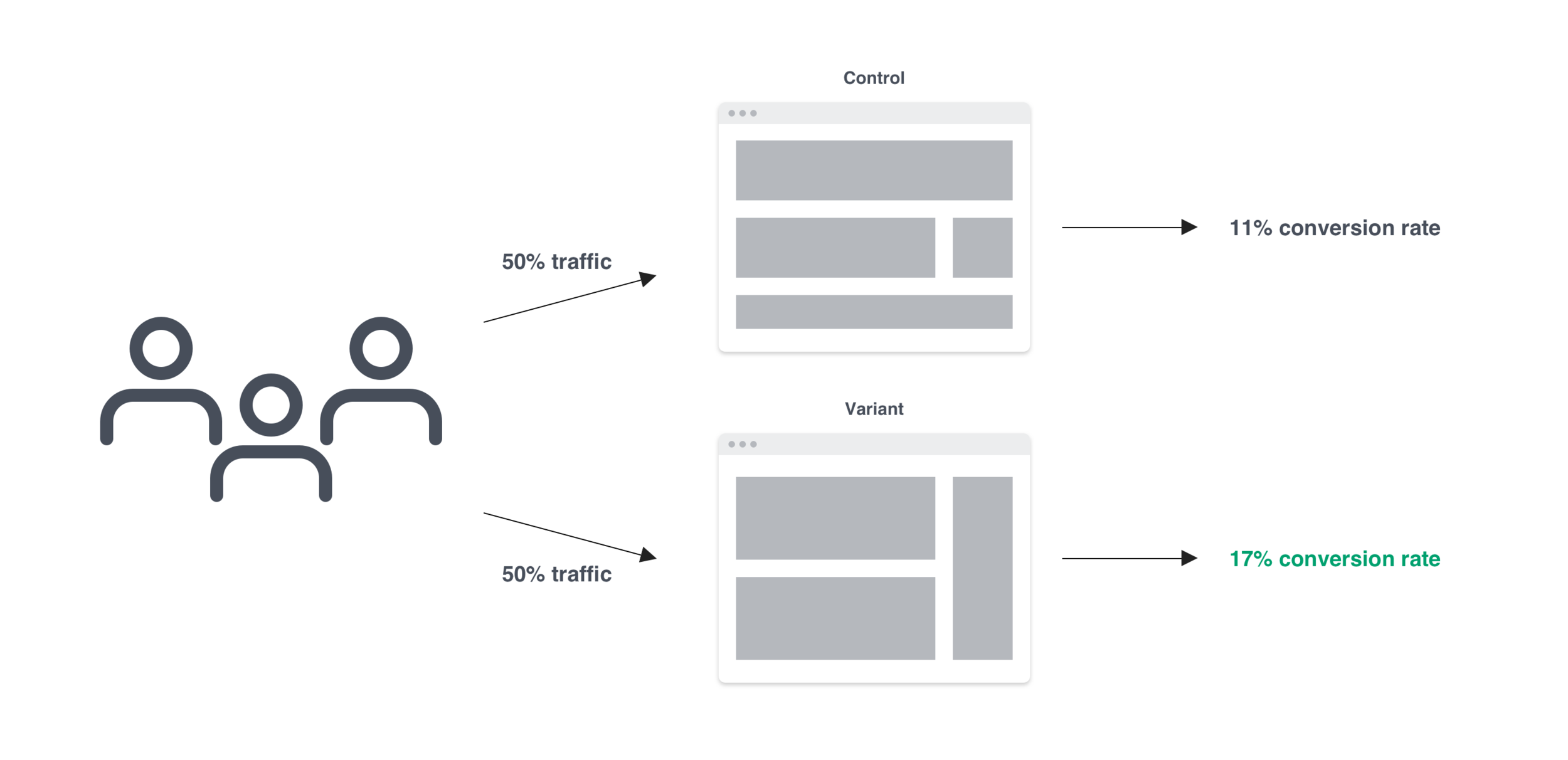
It’s a method of sorting web traffic between an unchanged page (the control) and a new design (the variant). It allows us to understand if changes to elements like design, copy, or imagery impact the goal of a page (donations, newsletter sign ups, event sign ups, etc.)
Testing was also a good opportunity to validate or disprove feedback and opinions from around the business, such as:
“Im not sure about the progress indicator on the left. Users will be put off because of the amount of steps being shown.”
“Thats a lot of steps!! Our users wont complete the form. Maybe removing or reducing the amount of steps will help conversions.”
“Cant we remove a couple of steps from the progress indicator? People might get put off by how many there are.”
This gave me the idea of running an A/B test with our CRO team on a couple of forms to find out if the progress bar is off-putting to our users and effecting the conversion rate of the forms.
Hypothesis
Does the existence of the form progress bar on desktop and the step counter on mobile impact progression through the form and total conversions?
This will be tested on the Heart of Steel form.

Multi-step form with progress indicator (control)

Multi-step form without progress indicator (variant)
KPIs
Progression through the form
Form conversions
Segmentation
Desktop and mobile devices
50% of traffic with and 50% without progress bar.
The results
This test ran between 03/12/20 and 04/01/21.

On average, there was a 1.7% increase in form page views from those who weren’t shown the progress bar.

Step by step, there isn’t enough of a difference between the control and variant to be statistically significant, but it does indicate that in this case the progress bar didn’t have a major impact on conversions either way.
Next steps
Share these findings with the wider business so that they are aware of what we discovered
Test other designs to indicate progression.
Testing other uses of this space on forms, for example using the space to increase motivation.
Discuss whether we want to even include this visual element in our multi-step forms
Final thought
The great thing about being able to run quick A/B tests like these is that it allows us to put the customer at the heart of what we do to build a long term “Give - Get” relationships, which links back to one of our strategic priorities.
The data also helps us move beyond assumptions to build better experiences that meet their needs and make it easier for them to engage with the British Heart Foundation.