
Online donations redesign
Online donations is one of the main ways donors give money to support the life saving research to beat many heart & circulatory diseases.
Cash donations generates around £2 million per annum. Donations made to the British Heart Foundation help fund vital research into the world’s biggest killers. Conditions like stroke, heart diseases, vascular dementia and diabetes.
The Brief
The purpose of the project was to review and improved the online donation journey through research.
When a user wants to donate cash through the BHF website there has been evidence that customers are mistakenly making a monthly donation instead of a one-off donation.
Persona
Eight personas, representing the main British Heart Foundation audiences were created in collaboration with Sift Digital.
The persona displayed below, representing our donor audience was continuously used throughout the Heart of Steel project.

Name: Linda
Age: 60
Location: Stirling
Life stage: Retired
BHF familiarity: High
“The British Heart Foundation were there for my dad. I want to give something back.”
Situation
Linda has been aware of the BHF for a long time. Her dad died of a heart condition a number of years ago, and she remembers him being given literature from the BHF during his time in hospital which was really helpful. Since her dad died Linda has tried to support the BHF wherever possible, for example by buying BHF Christmas cards and by putting a few pounds in a collecting tin whenever she sees one. She also makes a larger donation to the BHF every year around the anniversary of her dad’s death, with the amount varying according to how much she feels she can spare at the time. Despite her warmth towards the BHF, Linda hasn’t really thought about setting up a monthly payment. She prefers to give ad hoc, and doesn’t see any reason to change this.
Top tasks
Linda has £100 to donate in memory of her dad and decides to submit the donation online. She makes an ‘in memory’ donation and receives a thank you email explaining some of the research the BHF has spent donations on, and what recent advances there have been. While on the website Linda notices a box which promotes the BHF supporters’ newsletter. This was shown to her as the site identified her as a supporter or potential supporter based on the pages she’d viewed. Linda decides to sign up, and receives email updates which focus on the link between donations and groundbreaking research.
My role
I joined the scrum team to continue and lead the design of the engraving experience that was initial done. I worked alongside a content designer, product manager and front and back end developer.
What I did
Insight gathering
Sketching, prototyping, user research
Pattern documentation and best practices
Scope and constraints
Initially the scope was to improve the whole experience end to end, however it was then decided to split up the project into 2 phases.
Phase 1 - Improving the donation widget on the homepage.
Phased 2 – improving the donation checkout form.
This new component had to follow the BHF design guidelines, using existing styles and UI elements.
When creating the specification for the component we had to make sure all the necessary elements where editable within the CMS so that different copy and monetary amounts can be tested
First Steps
Mapping
To begin with I mapped out the existing journeys there were to donate money online for the British Heart Foundation.
This was a useful exercise because it allowed me to visually see and better understand all the different routes a user can take to reach the donate checkout form.
Although there are many possible journeys a user can take to donate their money, it was clear that those with highest conversions where ones coming from the websites homepage. Also

Deeper insights
Customer feedback
I set up a call with our Customer Service Center team (CSC) to find out any pain points/feedback that had been recorded.
After analysing and discussing with our Customer Service Center team we discovered a key pain point for our users.
Users were mistakenly making a monthly donation instead of a one-off donation.
Every month there were a number of calls from our donors to the CSC to change the donation type they had just made.
It was clear that users weren’t realising this monthly/one-off choice when completing their donation transaction online.
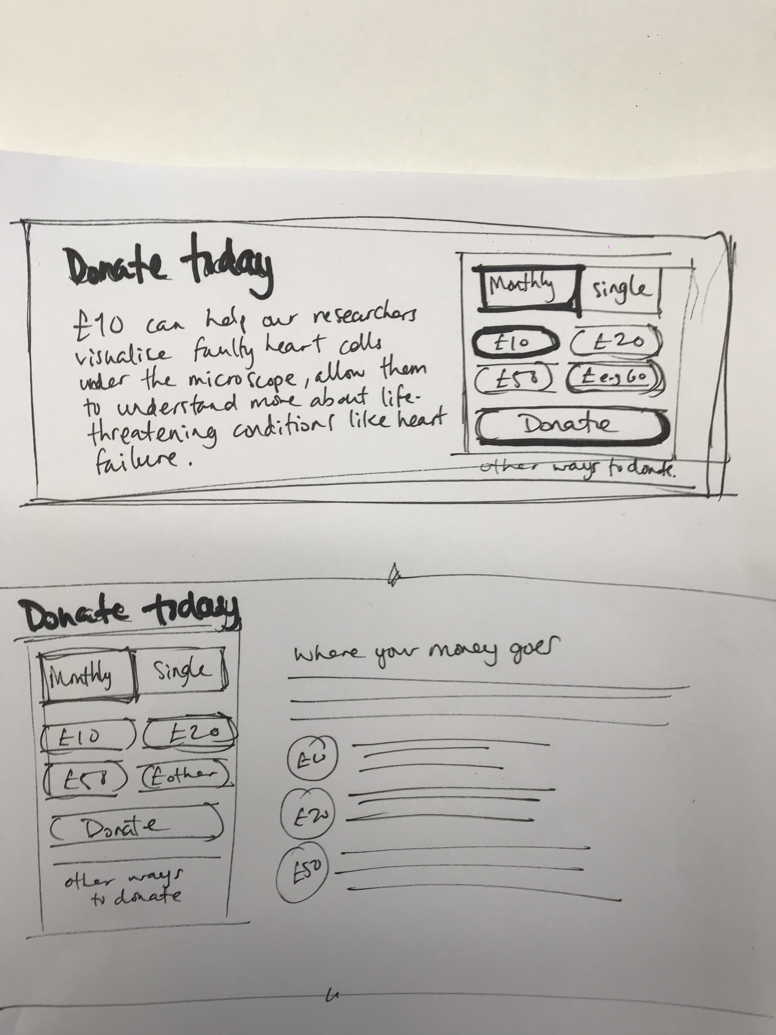
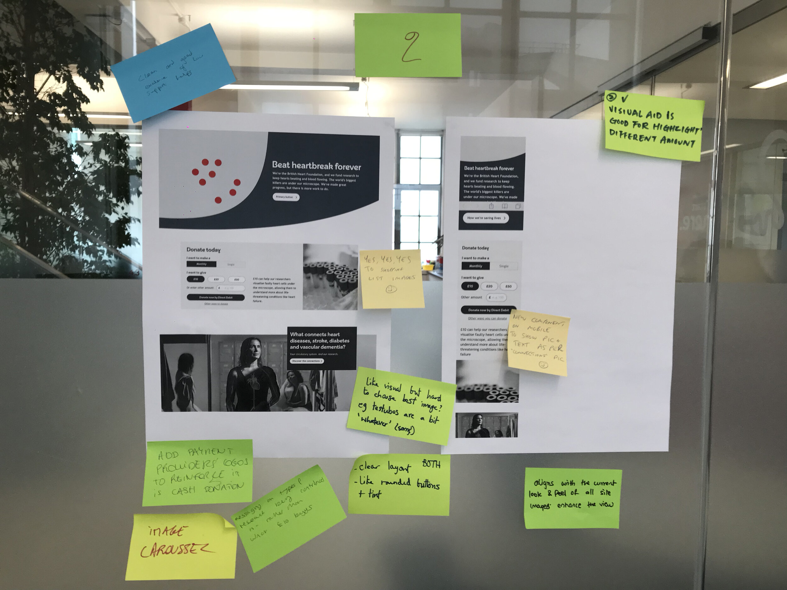
The widget
Comparative assessment
I reviewed direct competitors to understand what they where doing and evaluated each one based on a set of criteria like; content, design, functionality etc.
This allow me to define some best practises for the team to keep in the back of our minds when sketching their ideas.

A transparent, typical “Donate” experience has become the norm and donating should be made as simple and frictionless as possible.
An unclear and misleading layout is no longer attractive even if the customers have used it before. Organised and relevant content combined with a typical interactive experience (such as Water Aid or British Red Cross) is what customers are used to and expect.
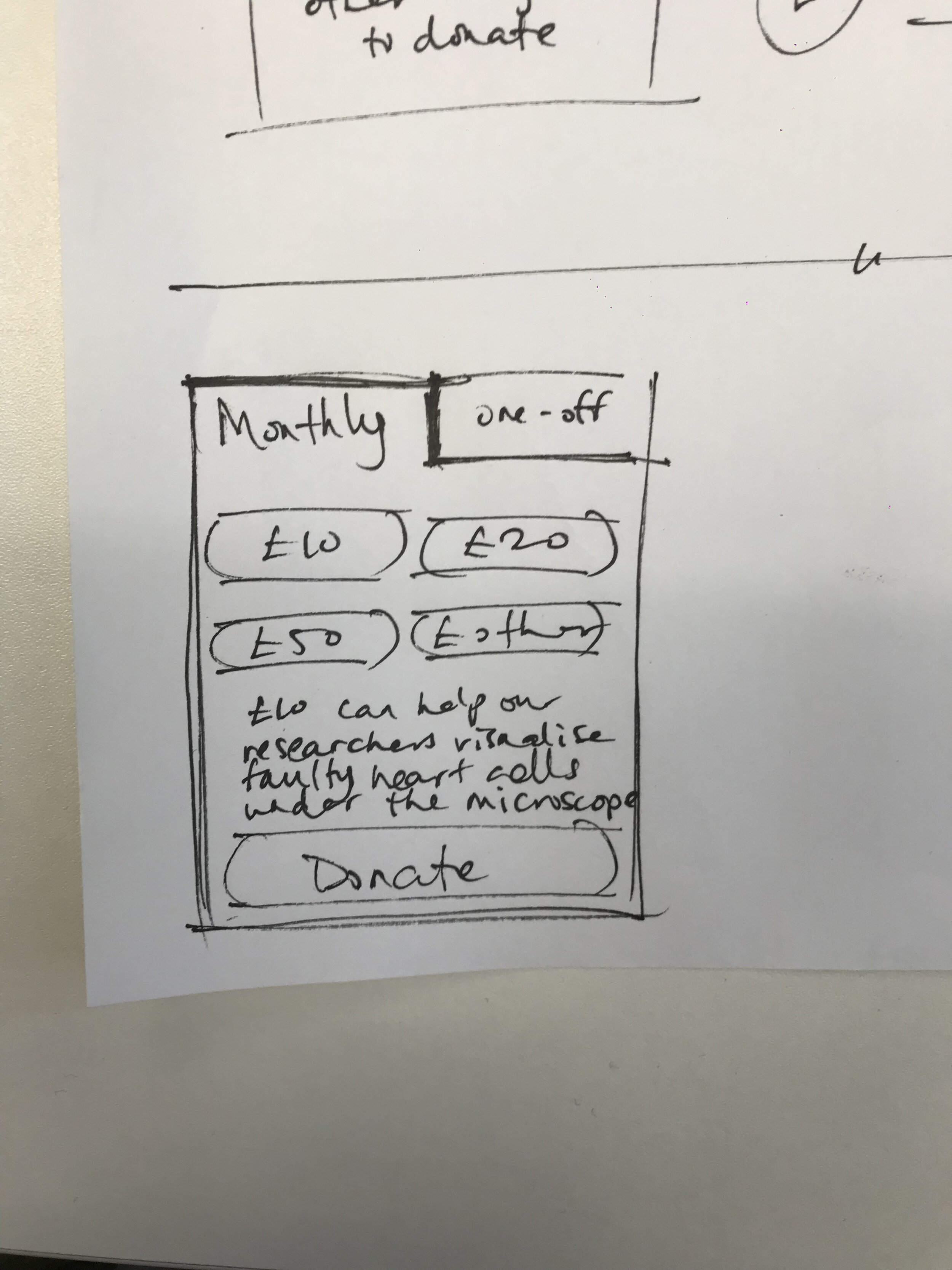
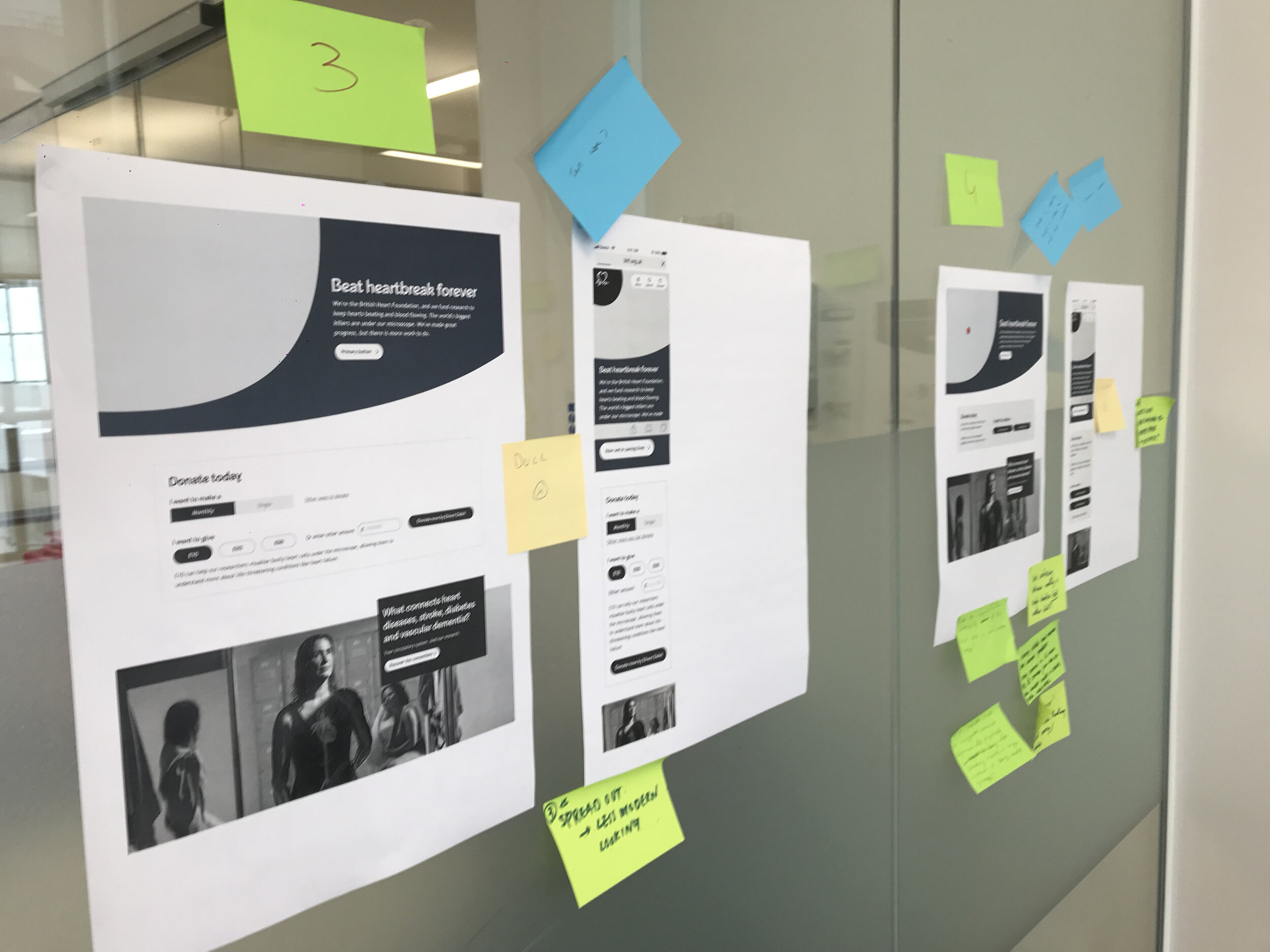
Ideating
Sketching and feedback
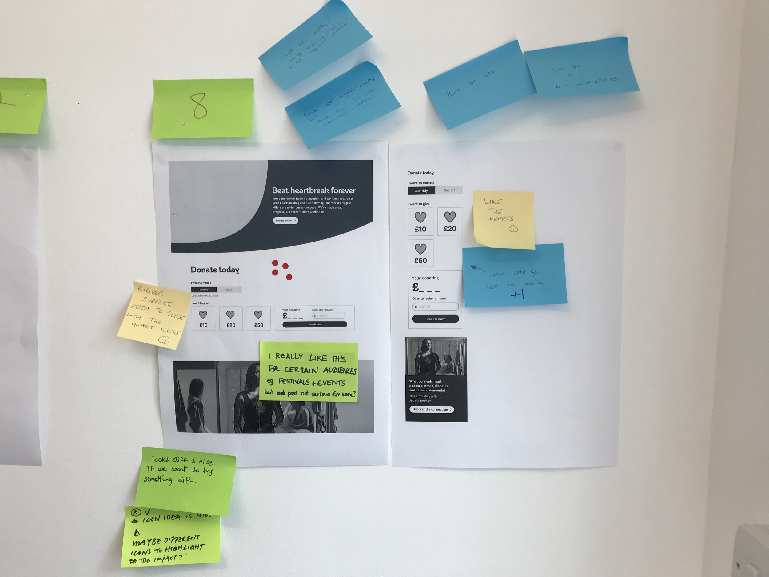
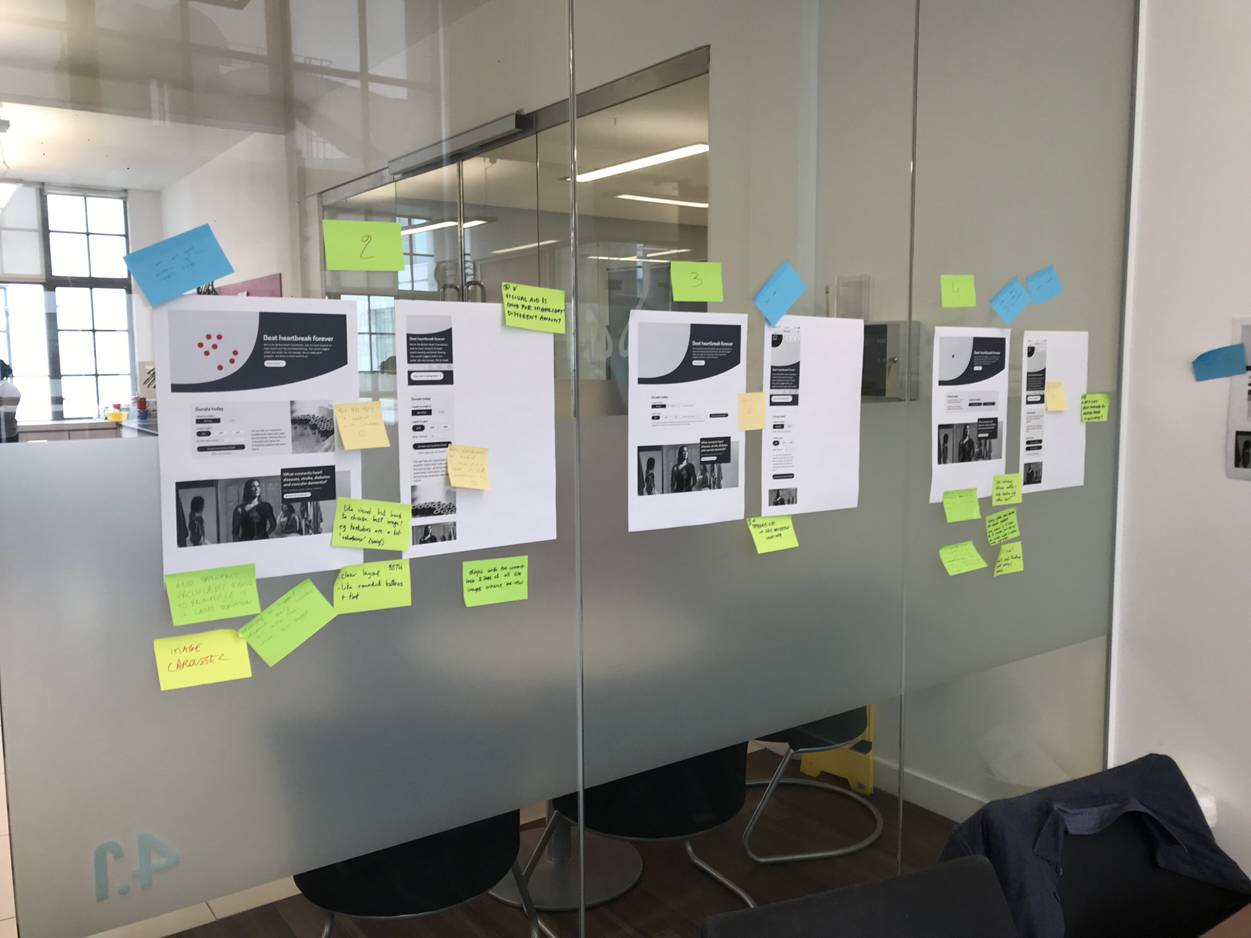
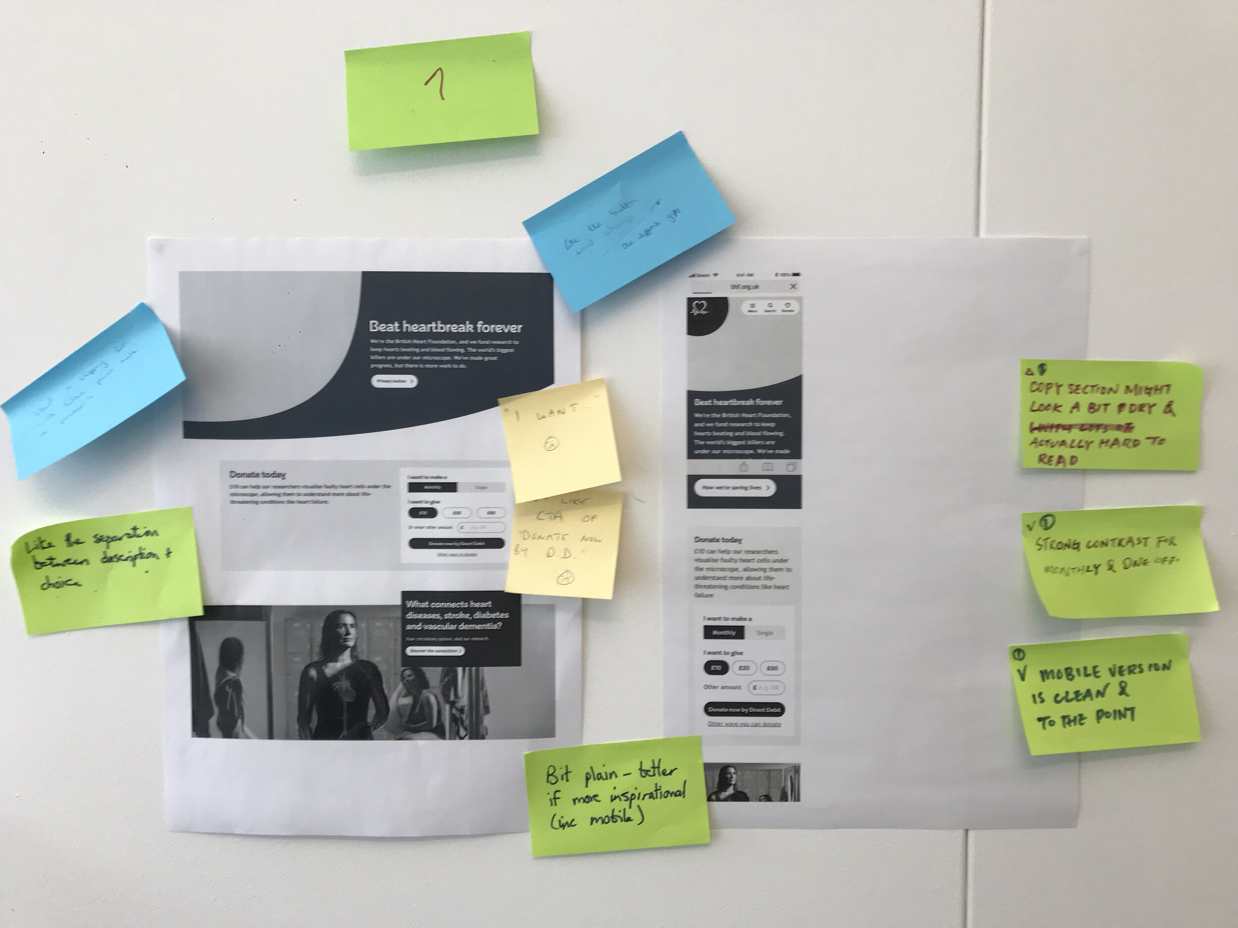
With this research and insights I quickly sketched out some ideas and shared them with the development team and and stakeholders.
A group session was set up and as facilitator I got the group, using post it notes, to provide feedback on all of the different concepts on display.
After discussing the feedback we time boxed a silent voted activity using sticky dots to see which designs the group preferred. This helped us to quickly choose designs that would fit the teams requirements and take forward user testing.
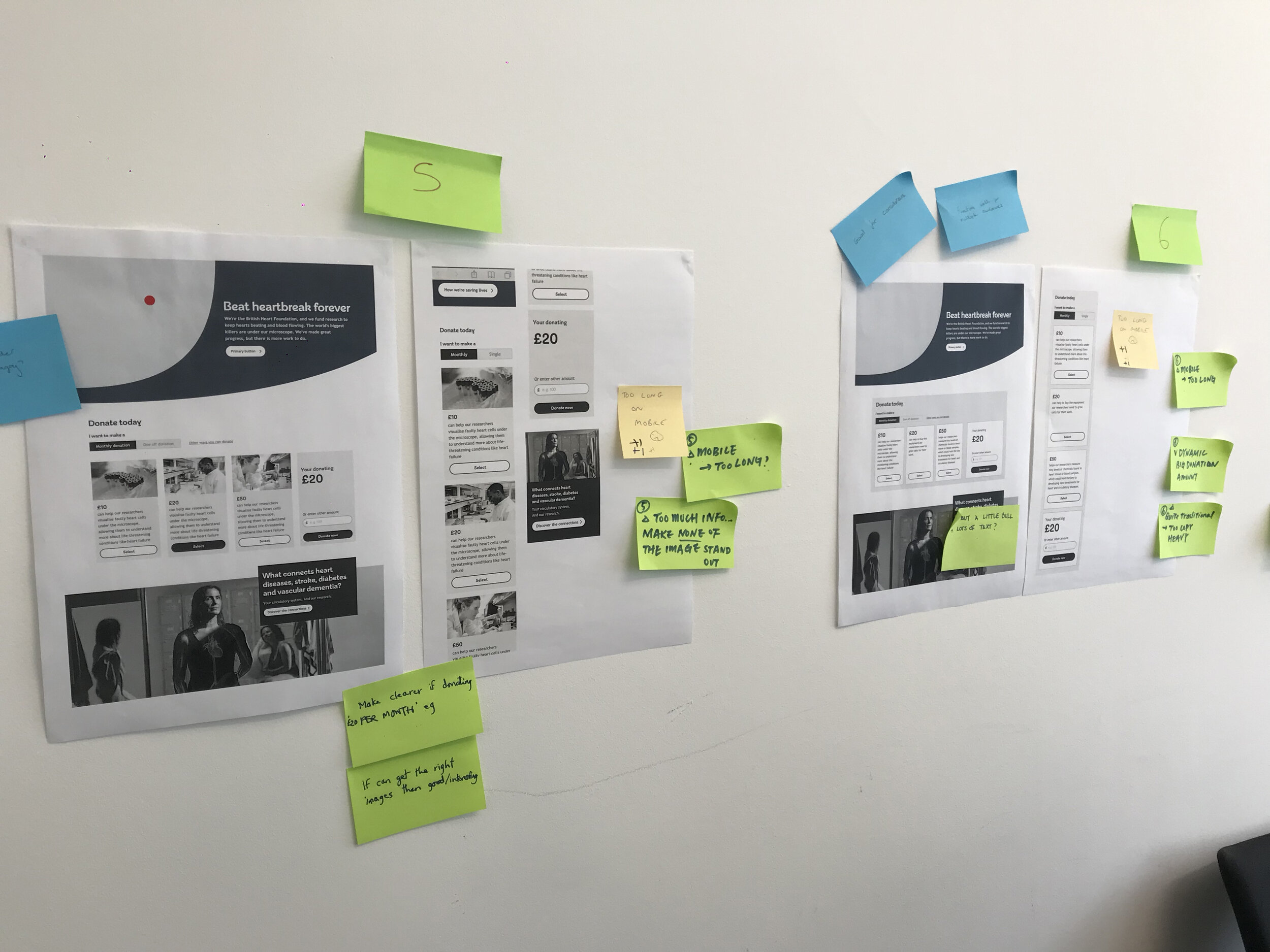
Unmoderated user testing
Remote user testing with Maze
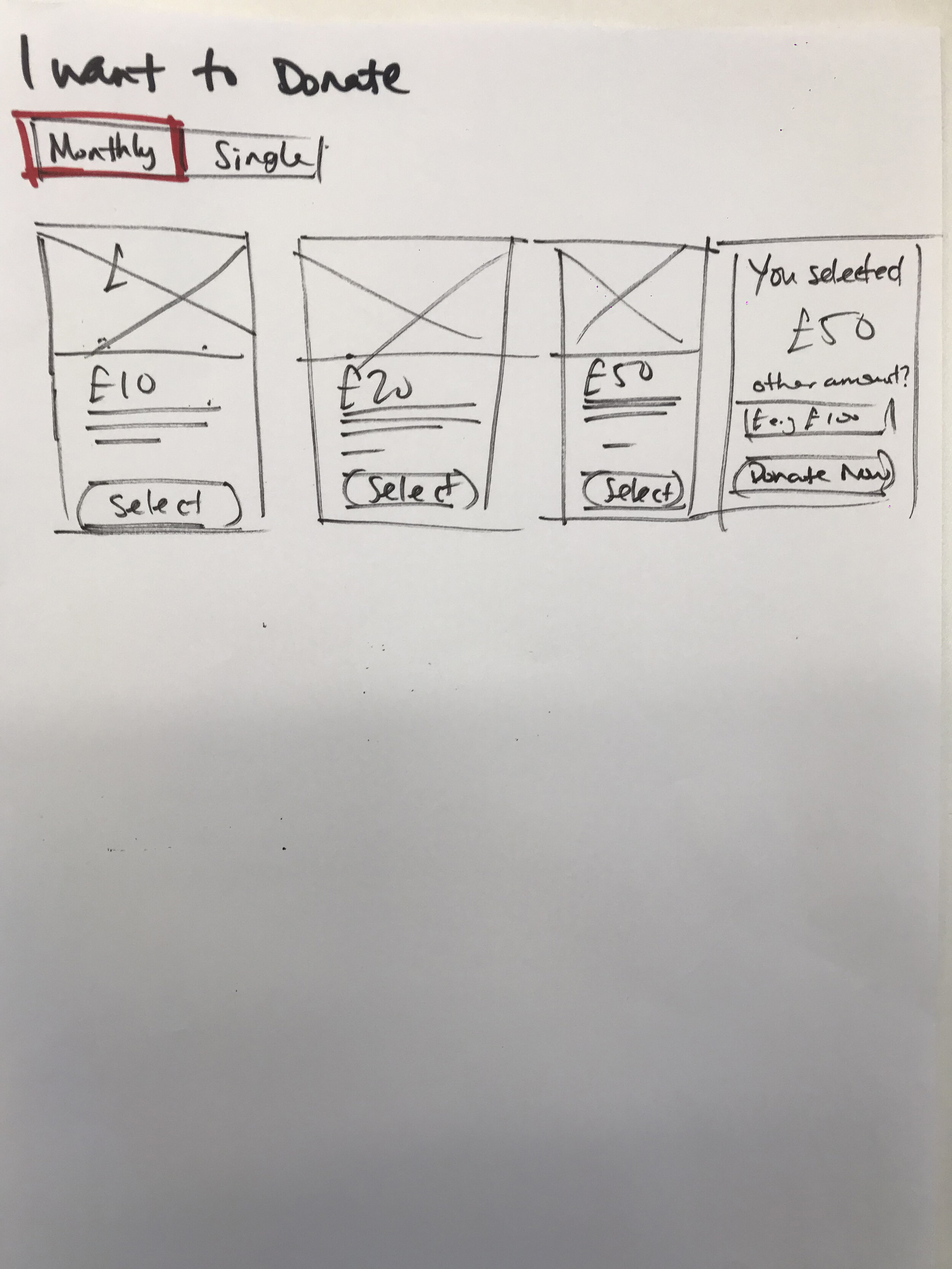
Some quick remote user testing using maze was done on the chosen ideas, within a complete donate journey prototype so that we could learn which concept they found the easiest to use when choosing “monthly” or “single” donations.

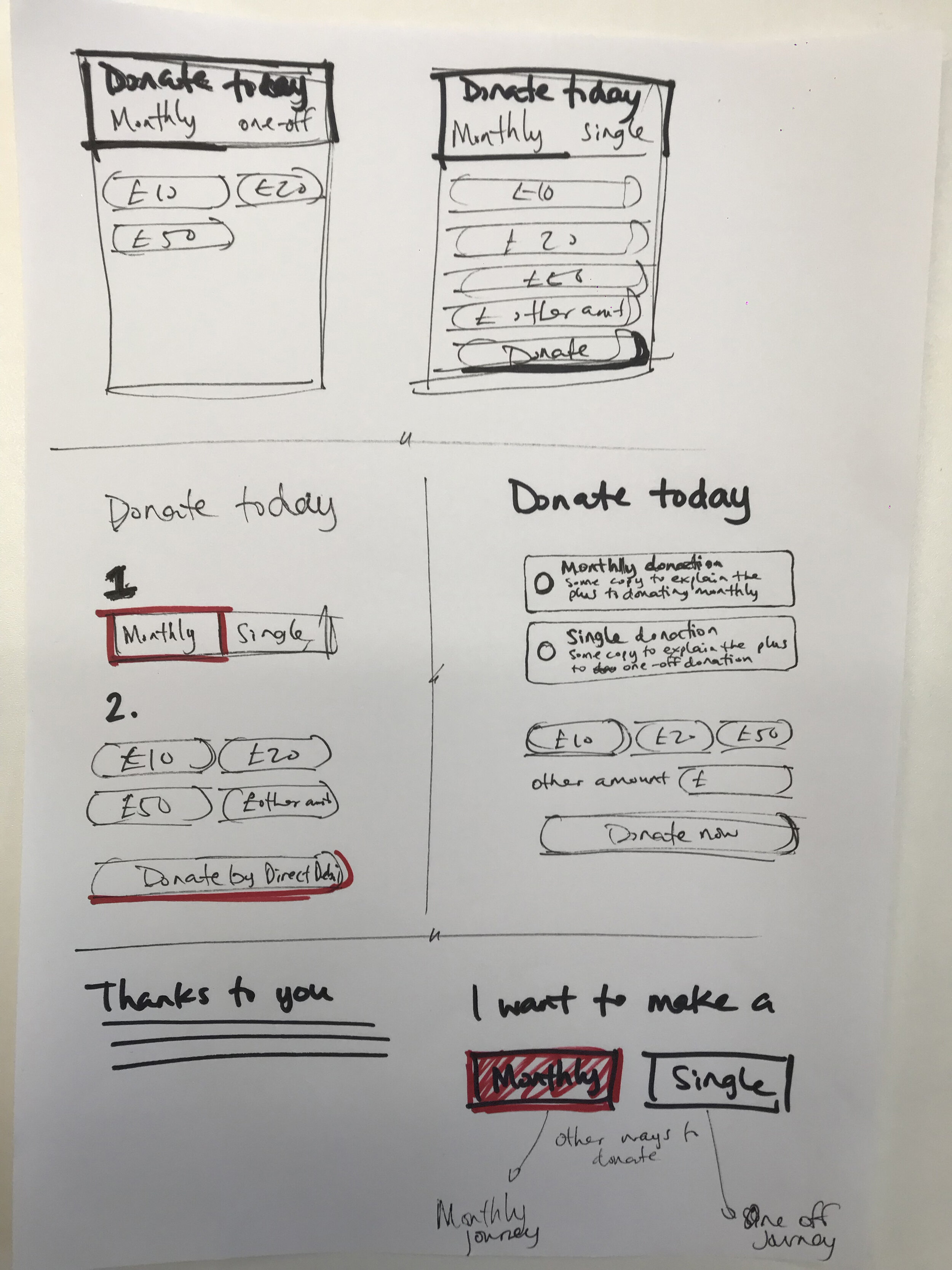
Concept 1

Concept 2
We also took the opportunity to ask a few extra questions at the end of each user task so we could learn a bit more about our users and expectations. We asked the following:
“Was it clear that you had the choice to select a monthly or a single donation?” (Yes/No)
“Which of the following would you expect to provide to make a donation?” (Multiple Choice)
“How did you find the tasks?” (Opinion scale)
Results
How they performed
After 2 weeks of the test being live I looked at the results and saw that for concept 1 there was a far less Give-up/bounce percentage when completing the task using concept 1. However when analysing the survey questions, both concepts received above 90% for “Yes” to the question; “Was it clear that you had the choice to select a monthly or a single donation?”.

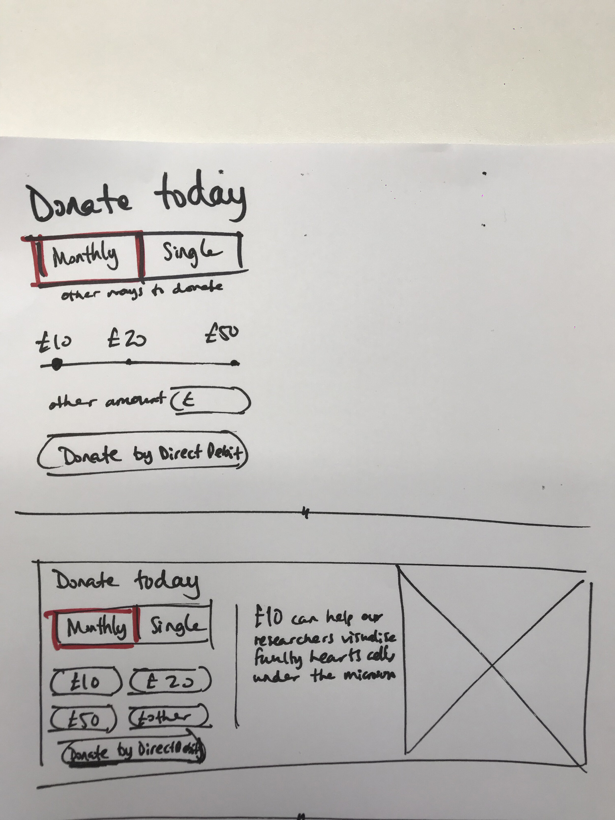
The redesign
The change

The impact
Great start but much more to do
The redesign of the widget as a great start to the over project and has had a positive impact with the users as well as the business. The component allows greater flexibility from a content perspective to push the push the British Heart Foundation message with the user of an image. We have also observed that
However, since launch we have continued to see a number calls coming in to the CSC team about customers still making the mistake of making a “Monthly” vs “Single” donation. We believe this will be addressed when we complete phase 2 of the project.